Communications Studio I: Understanding Form and Context
Through a set of specific and systematic exercises, we will explore typographic variables in clarifying a message based on the content’s hierarchy.
For this assignment, I chose the Open Air Concert Series, a live music concert series in St. Louis. Before launching into the visual analysis of the content, I first looked into the background and context of the event in order to get a better understanding of the brand and atmosphere.
Open Air Research
Presented by Kranzberg Arts Foundation, Open Air is a concert series that features musicians from St. Louis. Although it is an in-person event, Open Air practices COVID-19 precautions and physical distancing. It is an outdoor event with seasonal food and drinks. The November lineup features sounds of jazz, blues, rock, and soul on Friday and Saturday evenings, as well as Sundays for brunch.

Three Adjectives
Lively, cozy, welcoming
Descriptive Sentence
Open Air hosts a safe and vibrant space that unites the community to celebrate live music in St. Louis.
Visual Analysis
For the first portion of this project, we broke down and analyzed options for the content organization by first focusing on stroke weight, linespacing, and horizontal shifts.
When first taking a glance at the content, I highlighted which pieces of information were the most relevant so I could prioritize those for readability and spacing.

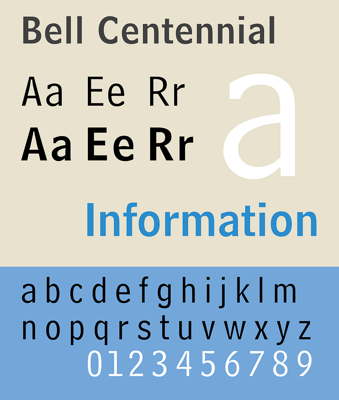
We were all assigned the font Neue Haas Grotesk Display Pro in either Light 45, Roman 55, Medium 65, or Bold 75. Before starting, I typed out the different stroke weights with the event title (Open Air) on the right to reference throughout. This way, I could get a better overview of the event typed out in Neue Haas Grotesk and the comparison of weights in relation to each other.

Stroke Weights
For the first exercise, we were asked to explore two different stroke weights per iteration set with type (17/21). We were not allowed to change the linespacing or shifting the type.
When I first started these exercises, I was primarily focused on contrast and seeing how significance is either highlighted or diminished by the stroke weight pairings.
Left: option for exercise; Right: labeled stroke weight for reference


Best Readability
After experimenting with more weight differences, I decided that Neue Haas Grotesk Display Pro Bold 75 paired with Roman 55 was the most readable format for stroke weight based on the content.

The Bold 75 immediately highlights the most important information on the page (the event title and musicians featured) without overpowering the rest of the content. I paired it with Roman 55 because it is still bold enough to be seen from a distance, but more so supports the main information instead of challenging it.
Linespacing
For the next activity, we analyzed linespacing by selecting just one stroke weight but inserting line spaces between lines of type based on hierarchy. For this exercise, I focused on grouping the content into relevant/related categories and prioritizing the title of the event.


Most Relevant Hierarchy

I decided that this linespacing was most relevant for grouping information based on content. Although the top part of the page felt a little crowded, I still felt like it was important for the time to be directly under the title so that viewers would understand the headline in context of an event.
Horizontal Shift: Two Flush-Left Margins
The third activity was also with one stroke weight, except we were to shift lines of type horizontally to the left or the right to create two flush-left margins.


Most Communicative
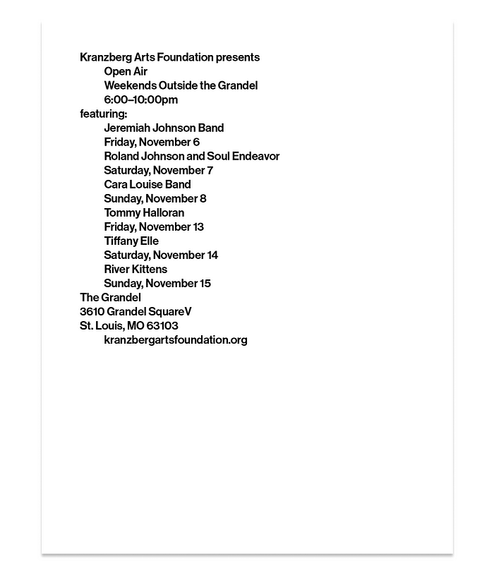
I chose this iteration as the most communicative for the margins because I felt like the spacing best organized the information into the main content and title content. By changing the tab spacing only for the musicians and the main event title, the rest of the clarifying information doesn’t blend together and acts as dividers for each part of the page.
Horizontal Shift: Three Flush-Left Margins
The last activity was similar to the third except we were utilizing three flush-left margins instead of two. This gave a bit more flexibility for spacing, but the flexibility also meant that the composition could become more confusing as well.


Most Organized Composition

I decided that this organized format had the most clarity because although it was similar format to my previous two-flush margin option, the extra tab for the dates and time helped add differentiation to the information as a supporting detail.
In Class Activity
In class, we placed our compositions and exercise options onto a Figma board to get an overview of how each student approached the constraints. After seeing the variety of options, I realized that during my own exercises, I had a tendency to find one thing that I felt worked and iterate on that one aspect. In hindsight, I should have explored other bolder compositions just to see would it would look like from an overview perspective.
Considerations:
- How can different strokes weights be used to grab the viewer’s attention? Nothing captures the viewer’s attention when more things are bolded than not
- Consider texture of the text; if everything is too even, the content will blend together
- Filling the entire page or the composition can make it harder to read or digest
- Consider/explore placing the content in other areas of the pages other than the top left corner
I realized that during my exercises, I was a bit too focused on relevance and didn’t prioritize the visual digestibility of the all the content together. I went through each bit of content and categorized it as “main” or “supporting” information, but this made it hard for the viewer to understand the system as a whole when looking at the paper.

In class, we were asked to make 3 solutions with two elements from the previous exercises. For my first option, I combined stroke weight and a two flush margin. For the second, I paired linespacing and a three flush margin, and stroke weight and linespacing for the last solution.
I found it was a lot easier to work with two options to help increase readability, but using too much of one element (such as linespacing) could fill the page too much or become confusing to digest.
Vicki also pointed out that I should begin exploring different placement for the text to really start experimenting with the text. I definitely could be bolder with how I try things out, so moving forward I plan to experiment more instead of getting attached to refining one idea.
Color Exploration
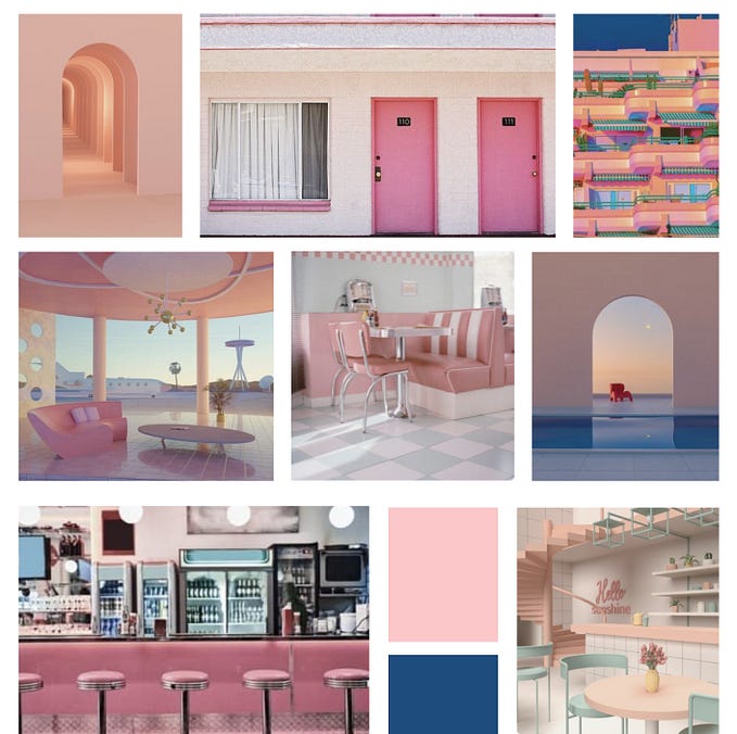
To start with exploring color, I wanted to first start with a breadth of different colors before narrowing it down to main ones. For this part of the exploration, I tried not to limit myself to only choosing colors that I felt related to Open Air, so I began my exploration with looking at the hues and tones in a wide variety of magazines, selecting which general colors stood out.

I then began organizing them by similar tones to get an overview of how each color might look in relation to each other, as well as a macro perspective on what colors magazines might use the most often.


Afterwards, I organized and glued down swatches of colors into groups that made interesting combinations. I tried to test out a variety of combos including warm/muted colors, bright and vibrant colors, and analogous or more monotone color combinations.


I found that the brightest color combinations caught my attention when paired together, but some of them were also a bit jarring. I really liked the color combinations with both some soft and bold tones, but I was also cautious of how one really bold color might overpower a composition or the rest of the colors being used.
Testing Colors & Paper Cut Outs
Moving forward, I tried to pick out a few colors that reminded of my three adjectives: lively, cozy, welcoming. I used some 8.5" x 11" construction papers that were selected based on specific adjectives, but I found myself having a hard time selecting a color that encompassed all three of these adjectives.
To get a better understanding of the text on color and different ways to arrange the composition/content across the page, I cut out strips of information from one of the previous exercises (stroke weight & linespacing) and arranged it on the construction paper to get an overview of how it would look.


I tried out the navy color to encompass the feeling of calm, cozy, and welcoming, but I’m not sure if felt very lively or upbeat for a live music concert. I also tested out shades of orange which were bright and playful, and cream/ivory which may create a more versatile and cozy feeling.
Digital Color Exercise
Next, I started working with color behind type, first starting with pulling colors from my magazine swatches and testing out other types of light colors to keep the atmosphere primarily lighthearted and comforting. I also tried a similar shade of blue from the construction papers with the digitally to see how it would look.
I created a few color palettes online to test out different combinations and hues, and I found myself repeated a lot of the same colors to test out how my favorite colors would look in different groups.

Then, I moved some of the colors that stood out the most to me onto the posters behind the text to see it in the context of the poster.

Based on these colors, I then began experimenting a bit with how these colors can interact with the text.

Although the use of color was still far from a “refined” look, these iterations were more of an explorative process in seeing how the text, color, and composition relate to each other.
Size Change & Stroke Weights
After working with color, I began testing out compositions with the content that involved scale changes with the same two stroke weights (bold 75 and roman 55).
For this part of the assignment, I was particularly focused on changing the size of the title in relation to the white space. I wanted to see what the title would look like when breaking the margins or on other parts of the page beyond the top left corner.

For my two compositions that I felt were the most captivating, I found myself gravitating towards the iterations with the largest “Open Air” text that bordered the edge of the page.


Although I was a little hesitant that these compositions were too bold, I think the experimentation with the scale of “Open Air” was critical to understanding how I can create a bolder and more “widespread” atmosphere that would align closely with the actual event.
In Class Activity & Discussion
In class, we were asked to explore color in a way that was more dynamic and explorative than a simple layout with different colors.

For this activity, I began experimenting with how shapes and color can interact on a page to highlight more relevant content. I made the color of the body text the same light color as the circle for contrast on the navy page, but I kept the rest of the elements on the composition a different variation of blue to keep the viewer’s focus on the poster content.
In class, we made a few different points on capturing the reader’s attention:
- How can subtle color changes draw the viewer’s attention to different parts of the page?
- What combination of colors might immediately catch the viewer’s eye? (Bright orange and blue, black and red, etc.); To what extent might the colors overpower the content or composition?
- How might the scale of the text guide the viewer in a particularly effective direction throughout the composition?
For my scale iterations, Vicki mentioned how my use of the scaled up “Open Air” and the cut-off from the edge of the page creates an effective use of “creating space on the page.” I really liked this idea of creating “open space” on my page, moving forward, I’m interested in exploring how I can utilize massive text across a composition and vice versa (small text & negative space).
Color & Scale
Before diving into imagery, I first explored some different color combinations with my compositions made from the previous exercise. Because I felt like a lot of my explorations were softer and on the safer end, I tried out some bolder colors and combinations that might spark some ideas for imagery color palettes.

I preferred the color combinations with light text on dark/bold backgrounds as it felt more engaging to look at on the page. I also surprisingly liked the orange and purple combination, which were colors I found myself gravitating towards over strictly cool color or warm color combinations.
Exploring Imagery
Using my previous scale compositions, I began adding in a few sample images on two 8.5" x 11" posters to first warm up to using text and imagery on the same page, and I tried scaled up to tabloid (11" x 17") with a picture of my own.


When looking for imagery, I wanted to center my theme or feeling of the poster around my three adjectives: lively, cozy, welcoming. However, these were by no means a set constraints, but starting points for imagery.
Original Image Exploration


Although these images definitely felt lively or cozy to an extent, I felt like a lot of it was narrowing too deeply on the content of the imagery that would ultimately overpower the text.
Instead, I was more interesting in utilizing imagery that would support the information on my poster. After changing the direction of the images, I then searched for images that were more intimate and clear on the composition. Essentially, I didn’t want viewers to be searching the poster for the text or information.
I then looked into featured instruments in jazz music at the event, as well as images that might capture the atmosphere or environment of the event.

Feedback
Before class, I had a meeting with Vicki to talk about the direction of the posters before digging myself down a rabbit hole of looking at possibilities of images online.
- Light bulb poster (bottom left) has the strongest composition as it captures that sense of atmosphere and cozy space, but she mentioned how the 2/3rds ratio of the light bulb could be utilized better with text or composition (create a more dynamic text guide)
- The images with the instruments feel a bit static without a touch of humanness, although the top left image has the most potential for a dynamic composition (play with text placement)
- Consider imagery that focuses on the sky and string light combination at night (my exploration for this feedback is bottom right!)
- The light abstraction poster (bottom middle) feels a bit distant from the actual Open Air event
Finally, she mentioned how using a more abstracted image such as the sky or lights might benefit from the addition of a subheading or line of descriptive text for the poster.
Moving forward, I plan to tweak the text on the top left and bottom left posters to create more dynamic compositions that are engaging and communicative.
Text Placement in Depth | Exploring Compositions
As I was most attracted to the light bulb imagery, I decided to explore different compositions playing with text hierarchy and composition, referring back to the scale exercise to see how I could make the text more interactive with the image.
I tried testing out different placements of the text so that the viewer could enter the page on the first light bulb in focus, and move to the content in a seamless manner.

Because I found myself making too many similar compositions, I flipped the image and tested out some more arrangements with the light bulbs path moving left to right this time.

I also tried rearranging the colors, but I still felt that the original color scheme was the most effective.
After talking to Vicki, we both agreed that that this composition (below) was the most effective in drawing the viewer in, and I liked how the end of the “viewer’s path” was the event title.


Before the final crit, I made some adjustments to the text hierarchy by brightening the colors of the main title and dimming the brightness of the text so it wouldn’t clash too hard with the light bulb and title. I also reduced the stroke weight from 75 to 65 for the band titles and readjusted some of the margins.
Because the imagery printed in lower quality, I also created another composition with the entire image in the poster, but I didn’t like it as much as the closer crop.

During the final crit, it was brought up that although the image was cropped well, the text might still be readjusted to better fit the arrangement of the imagery. So afterwards, I tried a few different arrangements to break the single column of text.


In the end, I felt like changing the text in relationship to the lightbulb might have been visually more interesting, but it didn’t help with readability of the bands.

Although I was glad I tried the changed text, I decided to stick with the column of text in the original final poster so I could maintain the readability and communicative composition.

In reflection, even if my final poster wasn’t as risky as some of my explorations, trying them out was an important to understanding what communicated well and what didn’t.
I felt like working in breadth was important for understanding which bold choices might fit well with the poster, and working in depth helped me shape the content in an informed and relevant way.

