Fall 2021
Brief
Humans share stories to strengthen and build connections between people; to share and to listen to another person’s story is a key part of understanding the human experience. This project aims to develop a multi-sensory experience inspired by the stories recorded by StoryCorps.
Design an experience that evokes the emotions and personal memories in the viewer that mirror or complement an assigned story by stimulating multiple senses.
Story
The story I was assigned was by Martha Escutia and Marina Jiminez, two granddaughters who reflect on their memories of “Papu,” their beloved grandfather who passed away.
The two granddaughters reminisce over their memories of Ricardo Ovilla (Papu), who came from Mexico as part of the Bracero Program, the largest guest worker program in US history. They discuss his lively and optimistic personality despite the hardships he faced as a worker in America and share the memories they had with him.


View the full story here.
Themes
When I first listened to the story, there was a wide range of themes that were addressed in their conversation. Papu’s story included hardships and fond memories that were deeply connected with his identity, so there were a few different overarching messages that I took away from the conversation:
Life & Labor
Throughout the story, Papu’s experience highlights the juxtaposition of a happy life and a laborious journey. Martha and Marina described him as someone everyone loved and cherished—a friend for everyone regardless of the language barrier.
Despite the countless struggles of labor work in America, Papu was described to always have an optimistic outlook on his life, shaping a warm environment for the rest of his family to grow up in.
The Immigrant Experience
Papu’s experience in the Bracero Program speaks to a larger problem that many other immigrants face in America; braceros were constantly underpaid and mistreated. Despite Papu’s humor and lighthearted response on his experiences, it shows the difficulties that workers faced when struggling to create a life in America.
Reminiscence
Although not explicitly stated in the transcript, the story context underlines an experience that most people can relate to—reminiscing over a loved one. Martha and Marina described small details of Papu such as his “worker hands” and small stature, as well as past moments such as his interaction with others in the neighborhood.
This heartwarming conversation made me reflect on my own memories and relationships with my family, and I resonated with the fondness that Martha and Marina had when describing Papu.
Brainstorming

After jotting down some initial considerations, I realized these topics had many areas of overlap; on a higher level, these topics connected to the idea of family, sacrifice, and hope.
While I don’t share the same experiences as Martha and Marina, I can relate to the feeling of respect and gratitude for someone who came to America and endured hardships for the sake of family. My parents were both immigrants who came to America and took on many challenges in hopes of being able to build a future for our family.

I started thinking about how many other families have endured similar struggles under a system that wasn’t built for marginalized communities.
How can I show the personal aspect of these systemic barriers? How might others empathize with these challenges or feelings of gratitude and hope?
I started sketching out a few ways to map out this path.


The concept on the left shows a simple juxtaposition of life and labor, with one side of the space focused on labor programs and challenges and the other side focused on family and collective experiences.
The concept on the right experimented with the maze idea, creating a build-up to the final room. While both of these concepts have similar interactions, I wanted to see how the different paths could change the user’s perception of the space.


Storyboarding
Based on a combination of both of these concepts, I thought about a general storyboard for the user’s journey in the space. I drew out a storyboard centered around the light orb/lantern interaction and how the overall path would lay out.

Mood board
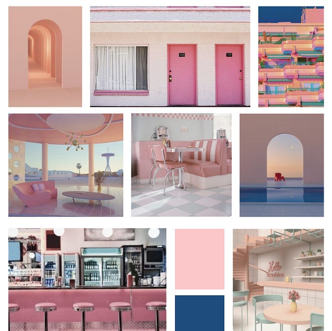
After exploring the interactions and experience journey, I started to design the visual atmosphere of the space. Because there were contrasting themes, I aimed to capture a mix of both light and dark tones along with the general theme of the content I was planning to highlight.

Moving forward, I kept my options open for introducing more color — especially for the last room/section. I wanted to maintain a visually cohesive space while also being able to show the different in themes.
Feedback
After talking with a few people about my idea, I began to get a better understanding of what was clear or unclear about the experience. I also decided to stick with Concept 2, which featured the maze-like experience.
I wanted to be able to craft a narrative that the user becomes a part of as they move through the exhibit, and my original idea of having just a split room did not allow for the depth or development I was hoping for.
One of my peers, Eric, mentioned that while it would be good to have information about the immigrant labor experience, it could also become close to an exhibit depending on the information I displayed.
Moving forward, I wanted to develop this content better so I could better understand the holistic story I was trying to tell.
Adjusting the Floor Plan
My conversation with Eric made me think about the potential to overwhelm the user with information to give them a stronger idea of what it might be like to enter a confusing, foreign space.
This made me think about direction signs, and the feeling of not knowing where to go when going to a new country. Although still undeveloped, I thought I could explore the idea of overwhelming the user with maze navigation directions to simulate the feeling of coming to a new place alone.


I added some possible misguided direction signs to the floor plan just to see what the overall layout could look like. I also made note of the ramps that would create an uneven surface to create a turbulent journey for the user.
As the space tightens and elevate, my goal is to encourage the user to become more reliant on the light/lantern they are using to guide them through the space.
I also moved the writing station/interaction to the corner to allow more room for the “hallway of hope.” This would also be able to provide the user with context to the change in space.
Prototyping
With such a tight floor plan, it was especially important for me to build out a model to understand what the space would be like.
I first created a basic digital model using SketchUp to create a visualization of the space I was making. While I had not yet added details, I wanted to make sure my physical model aligned with the same space I was originally imagining.


After getting the foundation set up, I started building out a physical model using foamcore to measure out the space and distance between walls.


I first created the floor plan in a 10"x10"x5" foamcore structure. Once I had the walls down, I started to add in the smaller details based on my newest parti diagram.
On the right is a rough model of directions/signs that could be added into each turn in the space. I also started adding in each of the ramps to represent the uneven elevation. I chose ramps over stairs both for accessibility purposes and for safety precautions for the user.


While the ramps were a little bumpy in the physical prototype, it was really helpful to see how the whole space looked relative to the small human figure. I didn’t have the right materials to represent the lighting or specific content, so I used placeholder objects and images for scale references.
Next, I started to build detail on the 3D model to reflect the updates I had worked on with the physical model.


I added the dark walls and ramps based on the floor plan. I didn’t want to make the elevation changes too drastic in order to avoid distraction from the content of the maze itself.


Next, I started to add color and text to the space to begin reflecting the experience concept. While a lot of the content was unrefined, it was helpful to see the placeholder text and add silhouettes to measure the scale of the 3d model.
Feedback
During class, we had a pin-up critique and went over our progress so far. My peers brought up a lot of strong considerations to take note of when designing the space:
- Having text to read, audio, and changing content could be overwhelming for the senses and might be hard to digest
- The hallway of lights feels very tight; the rest of the walls could be smaller while the final room becomes bigger
- The ramps don’t add as much to the experience as a more literal representation of the content; it could also be difficult to navigate
- The circular lights might be difficult to write on; it would be helpful to change the lights into firm box shapes and have shelves to put them on
Revising the Layout
Based on my feedback, I created a new version of the floor plan that simplified the experience better. Having the different ramps and long hallways distracted from the main goals of the experience, so I adjust the spacing and removed the ramps.

Based on the new floor plan, I rearranged my physical model to reflect these adjustments. I also added in the accent wall colors for the final room to contrast the previous darkness in the experience.


Seeing the new floor plan in the physical model made me feel much more confident about my decision to widen the final hallway and shorten the first half of the experience.
For the new idea with the lights, I changed the shape to be a box lantern to allow for an easier experience with writing. On the physical model, I created small yellow cubes to represent lights and added shelves to the hallway path for the user to put their lights on.


The next adjustment I made was the signage. Based on class feedback, the misdirecting signs would create a more direct response from the user than the ramps, so I did a quick representation of what this could be like in the space.


Moving forward, I needed to narrow down the content to better define the first half of the experience.
Digital 3D Model
For the content on the model, I began filling the walls with information and media related to the Bracero Program and Papu’s story.
For many of the walls, I pulled quotes from the transcript and displayed them on the walls to convey the most important parts of the message.
Based on feedback from peers, it was important not to overpopulate the walls; as the user might already have difficulty navigating the walls, having too much information to read would be distracting from the audio of the story.


The second-to-last hallway displayed letters of immigrants in the Bracero Program that were written to their families. These handwritten letters were dedicated to a variety of people, and the translated English would be provided on the side.


Feedback:
In class, I reviewed the updated floor plan with my peers to make sure the concept was still being communicated.
- For the “Write your story” activity, it might be more helpful to first display the lights in the hallway and then show the user the instructions. This way users can first read some stories before writing their own.
- The misdirected signs idea is still a bit vague — unless more developed, it might distract from the navigation and take away from the experience.
- Instead of having two shelves of lights, it could create a better effect if the lights covered the entire space.
- How would the users first select the light to begin with? Is this included in part of the experience?
Model Revisions
Moving forward, I started looking at ways to adjust the final room to create better engagement in the activity. I moved the “write your story” instructions to the right side of the hallway and used SketchUp to implement a more complete hallway of lights.


The bookshelf set up allowed for many more lights to be placed on the shelves. This way, the lights would also fill up the entire wall and create a more immersive experience for the user.

Using a 3D box model from SketchUp, I added in lights to almost every container in the wall space. Because I wanted to show the intentions of having the users fill in the space, I left many slots open for the user to leave their finished story inside.
This format also allows for more lights to fill up the room, creating a deeper impact for the collective experience.

With the new light component in my model, I created another station at the front to introduce the light concept within the space. This would hopefully allow for a more cohesive journey for the user.
Feedback
In class, I received feedback on the setup with the boxes. While the structure was much more immersive in the space, the next challenge was creating visualizations that would convey the “lights.”

Because of the shadows of the walls, the lighting in for the boxes was hard to visualize. In the final execution stage of the project, it was most important for me to support the narrative with strong visuals that demonstrate the interactions.
Designing the Visualizations
Moving into the visualization stage, I moved around the 3D model to see what images might capture a realistic perspective of the experience.


Using photoshop, I edited lighting into the screen captures to represent the glowing light the users are meant to use as a guide. I went through and removed the lines from the boxes and lightened the inside to visualize lantern-like boxes.


After editing the images to better demonstrate the experience, I started adding in silhouettes of people moving through the space. Because the lighting in my space was intended to be dark, it was difficult to ensure that the figures were clearly showing the movement.


My main visualizations features silhouettes of figures understanding the content within the space. To better illustrate how users would interact with the light guide, I developed some close-up shots of how users would hold the guide.


Finally, for the last hallway, I created two more visualizations to show what the experience in that space would be.


For this final room, I wanted to make sure the silhouettes were clearly demonstrating the interactions for the space. I also went in and added text to the lights on each of the lanterns to show the intended function of the activity.
Final Presentation
Self Reflection
In reflection, this project was an interesting mix of conceptual development and implementation. Translating a story into an experience was both engaging and challenging as we were forced to think about the context from a holistic perspective: what is the message of this story? What emotions are being conveyed, and why? How can I translate this into a space?
Many times, I found myself first asking “why”—and then “how?”—when making design decisions. Because much of the experience was an abstracted concept based on the story, peer-to-peer feedback was also crucial to ensuring that the idea was communicative. It was really important to not only see if other students were able to gauge my concept, but it was also really helpful to talk over the project out loud and organize my thoughts.
Moving forward, I’m curious as to how I can incorporate more of this thinking into projects that are not only related to physical spaces. This project opened my mind to different possibilities of conveying ideas through sensory design, spatial design, and design-thinking. Displaying my message through auditory immersion forced me to consider how to balance out feeding content to the user. While considering the spatial layout and human scale was a significant factor in this project, this high-level thinking and concept development would be useful as an approach for any design project in the future.

