Create a temporary exhibition featuring an artist currently on exhibit at one of the three museums. Consider how technology can augment content, increase learning and/or make the museum more interactive.
- Target audience: People in Oakland (specifically students, faculty, and staff in the College of Fine Arts and those with an interest in art and immersive experiences)
- Space: The exhibition would be installed within the first floor of CMU’s Miller ICA
- Goal: (1) Increase awareness of the client’s exhibitions to the general public and (2) attract more CMU students, faculty, and staff to the museum
Before diving into the prompt at hand, it was important for me to first understand the context of the project in environments design. In class, we explored our own understanding of an environment and the thresholds that define and introduce the space that humans interact with.
How can a physical space shape a human’s perception and emotions? What physical or digital features of an environment can foster a stronger connection to the humans within it?
How can the design of a space be both informative and influential? What type of interactions can achieve these goals?
How does an environment create a meaningful and impactful story?
These broader curiosities act as an incentive to explore the boundaries and dimensions of environments design as I strive to create spaces that will define and build upon users’ understanding of human connection through physical and digital interactions.
Selecting an Artist | Researching Charles “Teenie” Harris
After visiting the Carnegie Museum of Art, I was moved and inspired by Charles “Teenie” Harris, a photographer for the Pittsburgh Courier in 1900s. Known for his photographs of Pittsburgh’s historic African American community from 1935–1975, Teenie Harris’s work celebrated and acknowledged the Black population in Pittsburgh and empowered Black individuals.

My inspiration to choose Teenie Harris was both simultaneously drawn from the raw and emotional humanness of his works, as well as the holistic collection of his photographs that created a cohesive message in the space.


Reading and watching videos about Teenie Harris gave me a more intimate and deeper look beyond his work; his personality as a “people person” and “equal opportunity photographer” reflected in each of his photos.
Despite all his photographs being black and white negatives, his photographs nurtured a vivid and vibrant essence that captured the wealth of living.


Teenie Harris’s was a fully realized photographer with an ability to capture both the significance of the structural barriers of racism and the flourishing presence of the African American community in Pittsburgh. Moving into my concept development phase, it was critical for me to maintain and uplift this sense of humanity in my ideas.
Museum Exhibitions | Discovering & Exploring Interactions
Moving into the physical space, I was honestly pretty amazed by the depths of explorative technology in modern day exhibitions. Overwhelmed yet intrigued by the possibilities, I looked into ways current museums use AR to enhance their interactions for inspiration.
Before combing through the seemingly endless possibilities of ways to build an environment, it was first important to understand the space that my exhibition would be installed.
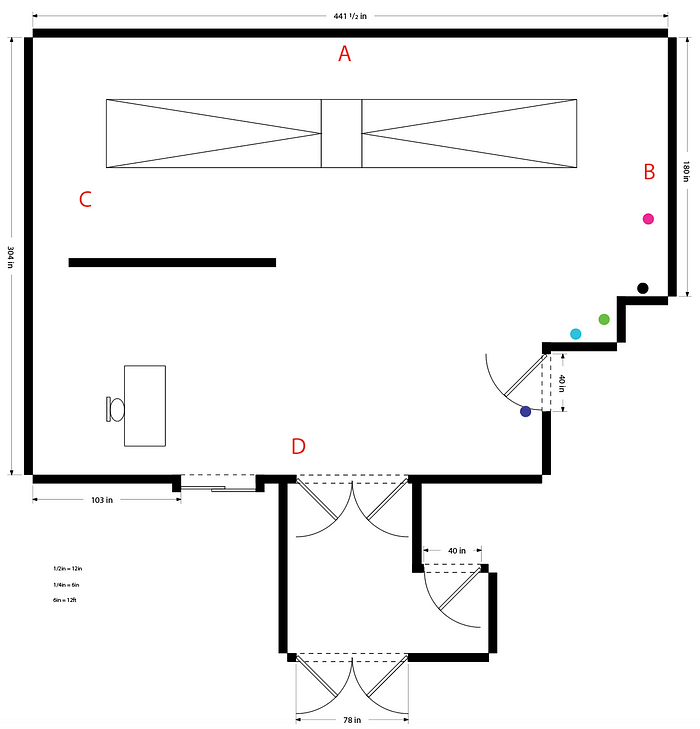


When moving into the logistics of my exhibition and installation, it was crucial for me to know whether my ideas are actually possible or not. Understanding the space of the Miller Gallery drastically helped me narrow down the scope of interactive installations and focus on the content at hand.
But early in my concept development stage, I found myself struggling to bridge the gap between using explorative technology and commemorating work that has heavily based in historic Pittsburgh.

There are evidently a wide range of functions for technology at exhibitions, but I faced a few critical questions in developing a space that would achieve my own goals:
How can my environment commemorate work from historic Pittsburgh in a “modern” or “advanced” way that would be entertaining for viewers?
How can my interactions be informative and moving at the same time? Engaging?
How can technology be used to enhance one’s understanding of both the past and the present? How can I bridge this gap?
In discovering ways in which I can make my interactions immersive and moving, I thought through which ways the different human senses can evoke feeling or emotion.
I realized that sound, sight, and touch were key directions to explore when creating immersive experiences to simulate or build an environment for the viewer.

Moving forward, focusing on these human senses gave me a foundation to build upon (in the midst of the explorative technology black hole). While not fully flushed out in detail, I laid out the basic narrative or experience for the viewers walking through the space.
By using pressure sensors or motion detectors in the walkways of the exhibition, the viewers path would trigger light, sound, and possibly movement from the photographs in order to bring the past to a present moment in time, allowing the viewer to live within the photograph for a moment.
As the viewer moves further from the photograph, the surroundings would dim back into a black and white negative, holding the essence of the past once more.

When developing ways to connect and shape the viewers’ sense of time, I looked into how other exhibitions also brought past moments into the present.
While some exhibitions used screens and visuals to tell a story of history (like this Time Machine Installation using audiovisual immersion), I also looked for ways that could be more physically interactive to build a stronger connection to the content (touch).
This JFK Moonshot project was an AR project that allowed viewers to relive the moment of the moon landing using augmented content that they could view with the positioning of their phones. While the content and nature of my project is quite different from this AR project, I wondered what ways I could allow my users to have control over the time and location they become immersed in.
When researching how Teenie Harris’s work centered around the Hill District of Pittsburgh and its conditions and residents, I found these side-by-side comparisons of the Hill District in Pittsburgh. Learning a bit more about the gentrification and development of the Hill District, I stumbled upon an interactive web tour that allowed users to “explore” historic Pittsburgh depending on the year.

In a more interactive and physical sense, I drew out an interactive system that could allow viewers in the museum to take a red Port Authority bus to a location in the Hill District that was significant to Teenie Harris. On the screen above, the viewer could then gain a fully immersive understanding of “then & now” Pittsburgh in a way that informs the viewer of Teenie Harris’s past and the importance of the location.
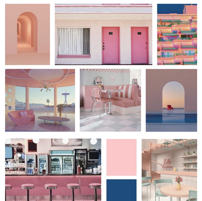
Visual Concept | Creating a Mood board
As I assembled a mood board to build visual direction, I first gathered a large selection of pictures and graphics. Selecting one of my favorites from Teenie Harris’s work (middle of top row), I then built my exhibition concept out on a board.

In preserving the historical significance of Teenie Harris’s work, I selected a few other black and white visuals that complemented the “vintage,” older aesthetic of his photographs. The visuals on the bottom left corner and top left corner aligned strongly with my goals of allowing the viewers in my space to feel immersed in the time period. However, these visuals not only act as creative direction for my exhibition, but they also contribute to my motif of movement throughout the mood board.
The repeated movement in my board captures both the presence of Teenie Harris’s title of “One Shot Teenie”—named from his tendency to arrive, snap his photo in one shot, and quickly disappear on the move again—and the idea that the viewer is moving through time in the exhibition. In addition, the moving figures speak to the shifting terrain of African Americans in Pittsburgh that Teenie Harris sought to capture in his works.
While the primary colors in the creative direction are monotone, I chose the bold accent color of red as it is a versatile color that can both convey vibrance/richness as well as solemnity. The intentional use of red in compositions frames a spark of importance against the grayscale in the rest of the images, bringing the content to life and catching the attention of viewers.
The TIME magazine content highlights the presence of past issues that Teenie Harris speaks to and utilizes the serif typeface Times New Roman to project a theme that is classic yet timeless.
Class Feedback | Direction Moving Forward

After sharing and discussing my process in class, there were a few critical aspects to consider in moving forward with my ideas:
How can I alter my touch interaction so that it is contactless (to adjust to COVID-19 times) while preserving the same goals and effects?
In moving from past to present, what are the themes I want to convey and unpack within each work/interaction?
How can I draw together a cohesive narrative in the form of a museum experience?
Hybrid Spaces Reflection
What other types of environments are becoming hybrid? Does the hybridization of the environment improve the user experience?
Technological advancement is inevitable. For better or for worse, humans perpetually seek ways to improve or enhance our quality of life through explorative technology, constantly iterating upon trends. As the presence of hybrid environments in our society moves in current with these changes, the “digital world” is imminent —if not already here.
Lifestyle environments such as work spaces and homes are becoming increasingly hybrid to support more convenient living activities. Groups such as smartspaces are digitizing the workplace through IoT platforms, allowing for building facility management to be done from the comfort of mobile phones.


Digital Twin (secondary IoT platform) uses a 3D build that applies artificial intelligence and machine learning for real time visibility and adjustment to building facility conditions. However, developed for increased convenience through remote operations, I found it particularly interesting to read about the goals and intentions of hybridizing the work environment.
“The Digital Twin acts as a node for improved workflow and an optimization management system to boost operativity performance, at scale.”
This idea of an improved workflow and optimized performance made me wonder: what is a human’s measurement of an optimal experience? Is it the ability or satisfaction to complete these tasks or goals, or is it having the convenience to omit them from our daily lives?
What is the balance between satisfaction from the “convenience” of technology and the satisfaction of manual or physical interactions? And are these mutually exclusive?
In current times, many are eager to criticize the increasing presence of technology out of fear that it will overtake or shadow human experiences in the “real” or “natural” world; however, often times, people will find that a reliance on hybridization could reduce these inconveniences while simultaneously enhancing these human experiences.
Perhaps with technology’s aid, the elimination of these “inconvenient” activities could create time — or space (from an environments perspective) — for even more meaningful interactions as opposed to a world without it.
In the classroom, hybridizing the space could still allow for human connection while also enhancing the learning experience for students. A study of the impact of AR science textbooks on lower secondary students in Malaysia shows that these technologies can be used to improve learning and motivation to pursue higher education in science-related fields.

There are undeniably gaps — or at least enhanced experiences — that can be achieved through the hybridization of a space (such as the classroom). As technology progresses, humans will continue to find ways to hybridize nearly every environment or space available. The question of whether hybridization is inherently good or bad falls within an understanding of how and why it can be used.

But while the user experience may not universally improve with hybridization, there are some genuinely wholesome and impactful experiences that can derive from these new environments.
In short, the hybridization of an environment can improve the user experience, but the definition of “improve” is both subjective and circumstantial. The line between invasive hybridization and productive hybridization lies within the human’s ability to achieve their desired experiences.
For some, this could mean the reduction of inconveniences in their daily lifestyles such as changing the room temperature, and for others, this could mean the ability to monitor a loved one’s health conditions from outside a surgery room on a screen. In understanding the hybridization of these spaces, the definition of “improved user experience” must be built upon the human experience itself in order to create these meaningful changes to people’s lives.
Technology Considerations | Hybridizing the Space
In incorporating technology and digital interactions into my own exhibition, this idea of enhancing vs. replacing human experiences was definitely a challenge in commemorating Teenie Harris’s work.
While one part of me was drawn to the exciting aspect of incorporating the most innovative technology to “wow” the viewers, I realized it’s more important to respect and share Teenie Harris’s work than create an interaction that would overpower the content. For me, this balance that I discussed in my earlier reflection can be found in how the exhibition uplifts his stories as opposed to speaking for it in his place. Essentially, these interactions shouldn’t overpower Teenie’s work, but support it instead.
First, I brainstormed/sketched out alternative interactions for the user to explore the hill district space without contact (with respect to COVID-19 times).

While I liked the idea of a motion sensor for the map, it may not be satisfying for the user to grapple at space as opposed to being able to step on the space that they wish to appear. This way, users can still experience touch through a pressure sensor and a physical experience without exposing themselves to risk of touching anything with their hands.

Although not yet finalized, I drafted a short list of Teenie Harris’s “stories” that I hope to showcase in the rooms of the exhibition. This non-exhaustive list of images speak to Teenie Harris’s focus on the black identity in Pittsburgh with visual narratives that capture the complexity of these figures. While these topics all have equal importance, determining the order (chronological or by location) is still undecided.
Parti Diagram | Outlining the Path of the Space
In order to lay out and understand the user experience through the exhibit, I outlined an overview of the space and the intended path for the viewers. The parti diagram acts as a framework for the stories I plan to share, as well as the experience they provide.
I started by laying out the key components that I had previously planned to incorporate through my mood board and interaction ideas.

After laying out the basic walls which would create the path for the viewer, I then began narrowing down which specific parts of the path would define the user’s journey through the space.

At the top of my parti diagram, I added the storyboards from my interaction to show a basic understanding of how people would fit into the space and interact with the exhibit. The exhibition is divided into rooms to provide that “immersive” moment in time for those entering and leaving.
Moving in and out of these rooms will allow for the user to physically pass through a threshold that defines a new time and space that tells another story of Teenie Harris’s.

However, there were a few concerns I had regarding my first iteration or initial parti diagram:
Is the space well distributed? Or will certain rooms or spaces be too narrow/wide?
How can I avoid the close quarters spacing between the desk and the bathroom door?
The slanted wall in the first hallway is intended to guide the viewers into the first room on the right — could the back side of it be awkward or is it okay?
During class, we received feedback on ways to make the space more comprehensible or easy to move through. This feedback brought up a lot of points that were brought up from the user’s perspective, as opposed to how I was planning out the space from a top perspective as a designer.


Many of these points were difficult for me to notice when shaping the space (other than a few issues such as the desk orientation) from above, but from a ground perspective I could definitely see where these areas could be awkward. For example, looking at the space for the doorways between rooms felt like normal doorways from above, but Jason pointed out that very small edges or chunks of wall could be awkward from a viewer’s perspective.

The most challenging aspect of the parti diagram for me was narrowing down and finalizing a path for my exhibition. After spending days looking through different examples of possible exhibits and interaction layouts, creating the parti diagram really pushed me to understand the constraints of the space and force me to decide on my own exhibition layout instead of looking at so many others.
Hybrid spaces | Designing the Future with James Tichener and Joshua Walton
Over the weekend, I finished the video that we started in class about how James Tichener and Joshua Walton approached their projects and explored the relationship between the physical and digital world.
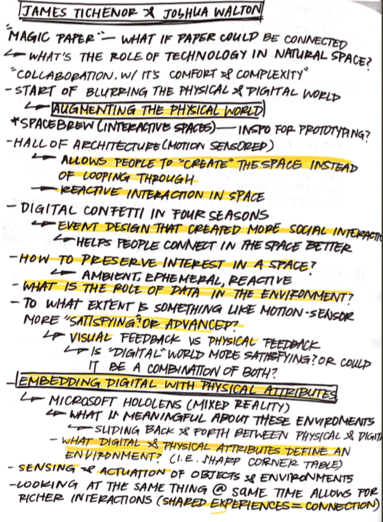
While many of the topics they discussed aligned well with the content we’ve been considering in class, they also answered and provoked many questions as they presented their design choices and explorations in their careers.
What is the difference between augmenting the physical world and embedding the digital world with physical attributes?
What role do viewers play in a reactive space? Answer: They become “artists” or “creators,” allowing people to create the space as opposed to passing through it
How can spaces create more meaningful interactions? Answer: By providing people in a space with shared experiences, they build a connection through stronger social interaction
To what extent is something like motion sensors more satisfying or advanced? How can you balance user satisfaction with visual or physical feedback?
Many of the discoveries Tichener and Walton made answered many of my macro-level questions about the purpose of creating these hybrid spaces, but it sparked another chain of questions, causing me to wonder about how to “improve” these experiences, and what that definition of “improve” really entails.
Physical Model | Building Out My Physical Exhibit
To layout the space and gain a better understanding of the exhibition path, we built physical models of our exhibits based on the floor plan of the first floor of the Miller Gallery out of foam core.


Taking the feedback I received from the last class, I made adjustments to my parti diagram to use as a reference to measure out and build my exhibit within the space. Incorporating these small spatial differences such as extended the walkway path or adjusting placement of the doors may seem minor from a top-down perspective, but I realized that these adjustments are key to shaping a more comprehensive story for the viewer.

Based on my diagram, I then added the core walls only to realize that my measurements on the diagram still made the space a bit tight in certain areas.

In order to create a more comfortable experience for people moving through the space, I made then adjustments to the walls as I went, measuring the space using figures/models of people to see how tight the movement would be.


Completing the rest of the ways of my physical model, I adjusted the size in the same fashion as the first one. Building out the model helped me visually understand which areas were too tight or uncomfortable for viewers and adjust accordingly.


Following the same colors and layout as my mood board, I made my walls black in order to create a sense of seriousness and draw attention to the content in red and the photographs by Teenie Harris. The stark walls created a space that envelops the viewers and creates a deeper connection to the “past.”


Laying out the space with the models as a scaled reference helped me better understand the size of the interactions (such as the Hill District map) as well as the spacing for each of the pieces. I realized I had more room than I thought I did on the walls, and less room than I thought in the actual gallery in terms of walls and walking space.


Moving forward, I need to flush out the content for each walls in order to fully unpack the “narrative” throughout the exhibit, as well as the details of my interactions to create the impact that I am aiming for.
Tinkercad | Prototyping my technological interactions
I then prototyped my my interactions using Tinkercad to understand the feasibility and better understand how they will work for the users.
This circuit shows how an object (green dot) will trigger the LED light to turn on when it moves within the field or sensors. This is the base idea of my interaction in which a person will move into a space and Teenie Harris’s photograph will essentially “come to life” with light and color.

Building upon this circuit, this prototype shows how audio plays a role in the motion sensor. When the green object moves in the PIR field, the audio (although jarring) begins to play as a result of that movement. For my interactions, this simultaneous reaction with the LED light will “animate” the room by bringing light and sound to present from a photograph from the past.
Feedback | Moving Forward
At this point in the process, it became difficult for me to move forward or fully develop my technological interactions without flushing out the content and laying out the “story” or concept of my exhibit.

Moving forward, I need to comb through Teenie Harris’s work to determine which narratives and problems my exhibit will foreground. Once I can grasp a better understanding of my goals and story, hopefully I’ll be able to make more intentional and thought-out decisions for my exhibit.
Design Role Reflection
How is the role of an architect and an environments designer different?
While architects and environments designers may have overlapping considerations at times, the practice and focus of each respective field are inherently different.
While both fields build and design spaces that hold experiences and interactions, architects often work around the physical constraints and materials of a space while environments design may take a more human-centered approach. I talked with my friend (an architecture major) and he mentioned that architecture can often times be restricted by physics, regulations, as well as a license requirements. In his class, they talked about how the Yokohama International Port Terminal is designed to resemble the rib cage of a pirate ship, building its resemblance through its physical form.

This felt a little different in approach when I compared it to the environments studio project in that much of our considerations were centered around the user’s interactions and emotions in the space — constantly revisiting the question of does this fit my conceptual goals when making large decisions. After looking at the Yokohama International Port Terminal, the space felt a bit more focused on the physical form while the users pass through it. And while these lines can sometimes be blurry, I think the approach and guidelines/goals of the projects is the key difference in these environments when it comes to architects vs. environments designers.

In building a physical and tangible space, much of the work in architecture is condensed into laying out how the materials and physical space can be arranged to create the desired interaction for the user. Environments designers, on the other hand, may approach a project from a more conceptual level that starts with considerations towards the human/user and build materials that work around those considerations (essentially, maybe not so different in practice, but different in thought).
And while environments designers may focus on considerations that can be based on a more micro scale (human emotions, interior design, etc.), architects also take on a more macro perspective when it comes urban planning and community.
An environments designer may make considerations based along lines of how does this space affect the user’s emotion? how can the user interact with the space in a meaningful way?
While on the other hand, an architect would make considerations such as does this structure fit well among the buildings surrounding it? Does this structure disrupt the flow of the whole community? (I.e. a factory in the middle of a residential neighborhood).
Additionally, architects often begin a project with an end product in mind, and the working process is built around achieving that end product or pre-planned design. Environments designers work on a more versatile medium; each iteration and approach is often based around inventions or technology at the forefront of development to create “new” and innovative spaces.
Architects commonly use tools such as program diagramming, 3D modeling, and physical modeling in order to build something that would ultimately be manifested into a physical form, or at least in theory. While environments designers also work with these tools as well, they also utilize tech like AR, VR, IoT, and other forms of technology that will ultimately create a space that is purely digital, or at least centered around technology. For environments designers, if the physical constraints prevents the goals to be achieved, they may turn to hybrid or fully digital spaces in order to enhance or even replace these experiences.
Digital Model | Making Decisions for Content and Space
After working on the physical model of my exhibit, we implemented our designs onto a digital model using SketchUp. Although a bit primitive, adding the details and changing the space of the Miller Gallery on SketchUp helped visualize the space from the viewer’s perspective.

In my next iteration of my parti diagram, I moved the position of the desk in hopes to find a better place for it other than in front of the bathroom door. In addition, I laid out the overall content in each of the rooms to provide more insight on the learning experience I hope to provide.


For the flooring, I kept a dark tile in order to continue with the dark theme that allows the viewer to connect with the “past” of the experience and create intimacy with the work. The red wall pops out in order to create a tone of seriousness yet vibrance in the dark exhibit, which is where the content for Teenie Harris’s biography and story will be displayed.
I also moved the help desk to the right side of the path where the viewers first walk in, reducing that awkward tension of the attendance desk being right next to the bathroom entrance. Additionally, this will hopefully guide the visitors straight into the path of the exhibit with a clear direction of moving forward, and the slanted wall will guide them into the first room.


Using SketchUp allowed me to understand the feel the space from someone who would be realistically moving through it. While the walls seemed short from a birds eye view, walking through the space helped me see how the walls guide the visitor down a specific path, enhancing that “journey” or narrative.
Before adding the content, I hit a point where I really needed to sit down and go through Teenie Harris’s work and make some hard decisions on which specific stories of his I wanted to unpack. Because I had some difficulty finding information about Teenie Harris that came from reliable sources online, I read through the book Teenie Harris Photographer: Image, Memory, History which was filled with enriching stories about Teenie Harris and explanations of the gentrification in the Hill District.

Reading this book helped me learn a lot more about Teenie Harris’s life, only confirming my understanding that he was a significant role in the community that was lively, compassionate, and well-respected. However, what particularly stood out to me as pieces that I wanted to incorporate into my exhibit is his deep and profound connection to the Hill District — and how the story of its gentrification unfolded.


While my Hill District interaction in the last room was a bit unclear, reading these stories and researching the “urban redevelopment” of the Hill District outlined a much clearer direction for the content I wanted to unpack in the final room. And the brilliant thing about Teenie Harris is that his photographs all tell stories themselves — each one unpacking rich and vivid emotion and experience.
Researching Teenie Harris’s life naturally made me more inclined to certain photographs that I felt shared this same story of the Hill District, as well as fully captured his admiration and love for the community.


By selecting pieces that show the spirit and celebration of the community as the first part of that journey, the story will then transition into foregrounding specific issues that impact these communities.


These photo narratives will hopefully create an increasing connection the people in the community as these people move along the path.


By unpacking this content with each room and walkway, these photographs and stories can hopefully speak to the voices of these communities that Teenie Harris was passionately connected to.
Feedback | More Details to Work Out…


Although I went through my content and clarified which stories to unpack and present, after desk crits I realized there were many details with the physical space I need to work through. On top of adding in a concrete call to action for my story at the end of the exhibition, it became clear that I need to begin laying out the text, images, and graphics of my exhibit to solidify all of my ideas into the exhibit.
While I have a direction to move in, these details are critical to rendering out an effective and realistic exhibition. Essentially, now that I have things worked out conceptually, it’s time to crack down on specific features to implement in practice.
Experience Guide | Transitioning from Concept to Reality
As I begin to implement more details and information into my exhibit, I wanted to make sure I wouldn’t stray from my concept or find myself moving in the wrong direction. As a way to clear up and summarize my own thoughts and goals, I created an “experience guide” that clearly outlines the goals of each part of the space.

The purpose of this experience guide is to define each space and the exhibit as a whole so that I can refer back to it as I make progress in the project. Ideally, when making decisions, I can ask myself: does this design decision align with this story or concept?


This way, I can prevent myself from overstepping the boundaries of the project while also forcing myself to ensure that I am achieving the desired narrative of my exhibit. It also helped significantly in condensing my thoughts and research that have been building up over the course of the past few weeks by giving me a concise description of my project.
Technological Interactions Reading | Bridging Digital and Physical Experiences
After class, I read this article that discussed the overlap and gaps between physical and digital experiences. Reading about the transitions between these spaces was particularly interesting because over the course of the past few weeks, I feel like I’ve been especially bogged down on the details of my technological interaction but not necessarily the transitions between.
It is in the gaps between online and offline environments, between devices, and between related service providers that users often lose support, unnecessarily repeat actions, or miss information important to completing a task.
Addressing this gap, the article talks about how designers must anticipate these experience gaps and overcome them with the least amount of friction to preserve engagement. It also provided a variety of examples of technological interactions that I personally feel increase engagement or convenience in people’s lives — going back to the question of “improving” user experiences I discussed in my hybrid space reflection earlier.
It is important for college design students to pay attention to the full cycle and to understand that designing for experience is really about people’s goal-oriented behavior, not about objects and spaces.
The article also defined touch points as any type of contact or interaction between an organization/company and a goal-oriented user. By designing around these touch points, a designer can emphasize and influence these decision-making moments that can be crucial to defining an experience. This idea that touch points are conversational (two-way interactions) builds significance and value in a designer’s role in these experiences.
Interaction Details | Refining the Exhibition Experience
I revisited my parti diagram (again) in order to make some spatial adjustments for the path and add in details to make it more representative of my imagined space.

In this iteration of my parti diagram, I made some adjustments to the walls by shortening them to allow for more walking room or to create a space that is wheelchair accessible. In addition to creating smoother transitions between rooms, I also pushed the “Community” room wall closer to the right in order to create more space for the desk in the lobby/main area.
I also added the spaces that my technological interactions will be installed, labeling each one with the assets meant to be implemented. This includes the interactive floor map in the “Hill District Interactive” room and a “call to action” station in the corner of the room.

After iterating on my parti diagram, I drew more storyboards in order to flush out the details of my interactions. At this stage in the process, especially after my physical and digital models, I had a much better understanding of where my interactions would take place and how they would fit into the space.

The first interaction in the “Community” room in which the full-scaled screen will “come to life” when the viewer enters the room. By making these interactions full screen, the viewer can be immersed by seeing the people in scale.

Moving through, the performance photograph will create a space that is lively and vibrant.

The final room will allow the viewer to select a significant spot on a Hill District map in order to understand the effects of the demolition of the Hill District that Teenie Harris captured in his images.
Physical Model Details | Implementing Design Ideas
Once I had the details of my interaction outlined, I moved forward in testing out how they look visually. Although the craft was a bit rough (will improve on this in future iterations!), it gave me a pretty good idea of how the space would look based on my new parti diagrams and technological interactions.


Seeing the “screens” on a larger scale gave me a much better idea of how the technological interactions would work, as well as how immersive the experience would be. I added text at a very small scale next to the photos, although I need to scale down the size of the original photos for the next iteration.


Adding the text and graphics gave me a stronger understanding of how much smaller/bigger everything needs to be, as well as the “flow” of the exhibition. Now that I have my pieces chosen and narrowed down, moving forward, I can focus on arranging these pieces and text to create the most effective and impactful experience for the viewer.

Digital Model | Developing Visualizations
After making these adjustments to my physical model, I moved forward with refining my digital model in order to implement these details into a digital space. This way, I could see how these changes would look from a person’s point of view.


Seeing the overview was helpful in matching my SketchUp model to my planned exhibition as it also highlighted more flaws than I had noticed during my other models.

After making these changes from my parti diagram, I went through and added in the pieces in order to visualize the space better. I also added a station that would list out ways to become involved with the Hill District Restoration Plan. This space will utilize the viewer’s experience from the exhibit and channel that momentum into action for the neighborhood.

Seeing the spacing on the wall felt a little off as certain parts were a bit too high or too tall. Moving forward, I plan to alter my elevation plans to better fit the scale of a human.

One other concern that came to mind was that the scale of the photographs, although I wanted them to be scaled upward for an immersive experience, meant that the figures in the picture would stretch too large to be comfortable for the viewer passing through.


Moving forward, I received feedback on lowering the scale of the first two images as well as desaturating the red. The red image in my SketchUp model was definitely a bit too bright, and I plan to implement these changes into my next iteration of my physical model with finalized changes.
Refinements | Adjusting Scale, Lighting, and Space
Before implementing these changes into my physical model, I first wanted to see how it would look on the digital model in order to save time and materials.


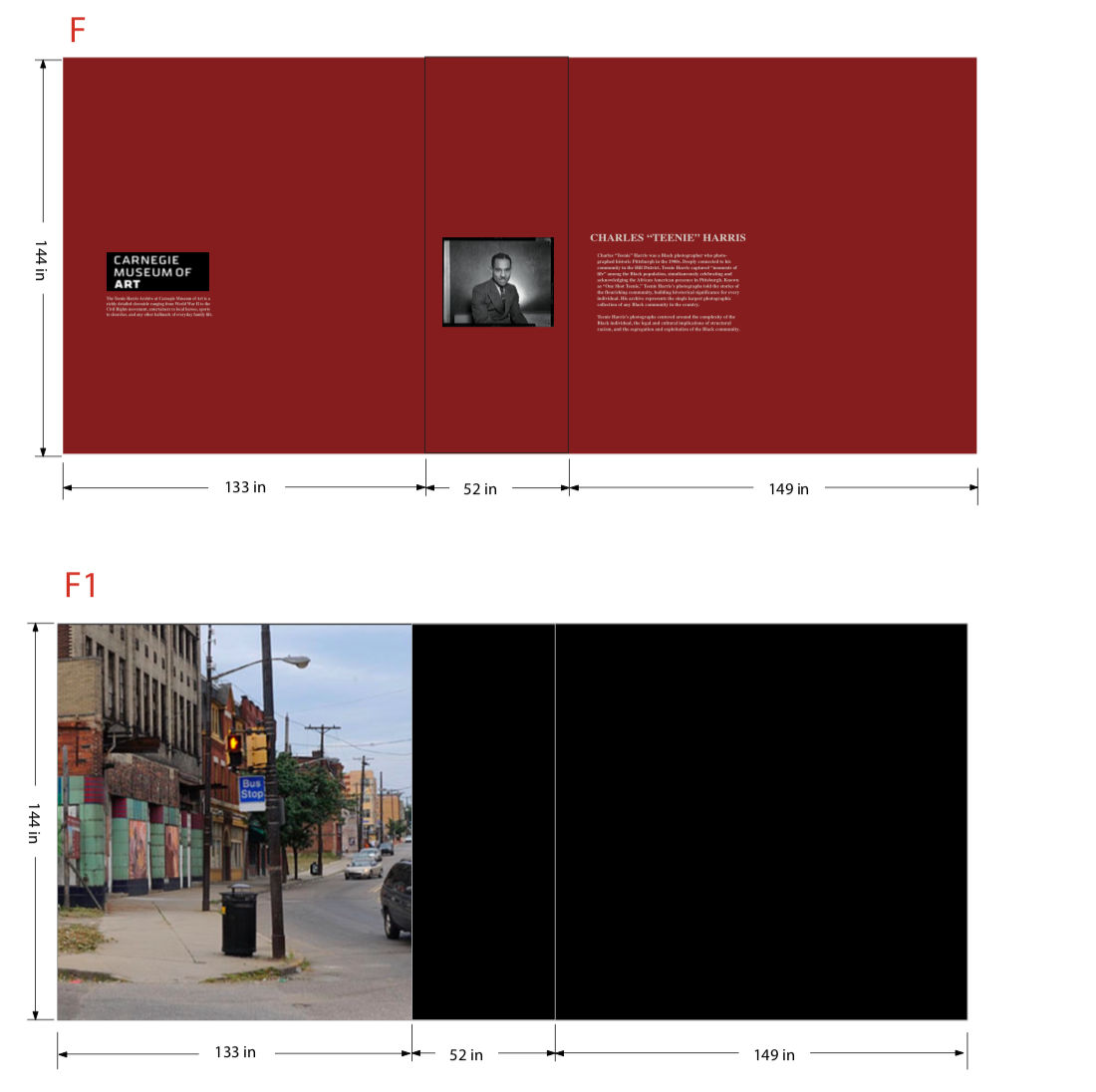
I first made adjustments to the scale of the images in order for them to be eye level for those who are lower than the typical male figure (model).


I also desaturated the red of the entrance so that it doesn’t hurt the viewer’s eyes to look at, as well as implementing text that would provide a background and biography to Teenie Harris.
I also adjusted the size of the portrait of Teenie Harris at the entrance as I felt that it was too large and uncomfortably overpowering in my previous iteration.
While I originally planned for the text to be black, the readability was quite poor so I shrunk the text for better viewing and changed it to the cream/white color from my visual art mood-board for reference.
For the floor map and the walkway interaction, I used procreate to draw out what the map of the Hill District would look like as well as the walkway for the “second room.”


Putting these in the space gave me a much better idea of what the interactions would feel like.


I also decided to take different shots for my visualization that would hopefully be more communicative of the space and significant parts of the experience. On Photoshop, I added a glowing light around the interactions to indicate what it would look like when the user is interacting with the space.


I also added a “spotlight” using a soft lighting to certain pieces to provide more lighting for the space and create an intimate viewing space for the user and the piece. This would illuminate the work in the dark space while being able to preserve the dark walls that allude to the feeling of moving through time and into the past.

Here at the Hill District Restoration station, the user will be able to take their information after the exhibition and funnel it into the varying solutions I will provide to get involved with restoration.
The text on the wall describes information with multiple ways to allow the viewer to become involved, pulled from these ongoing plans as my source of information and access points.
These include many different ways to help with anti-displacement strategies that would combat the segregation and exploitation of the Hill District neighborhood.
Because there was possibly too many options that might overwhelm the viewer instead of simply allowing for different levels of involvement, I narrowed down the solutions/strategies based on these specific goals.

The red box in the restoration plan will give the viewers a “submission” area depending on the anti-displacement strategy they choose to become involved with.

Below are the final elevations that I used for scale for the digital model in order to properly level everything for the viewers.


Physical Model | Finalizing Changes
After finalizing my digital model, I moved into implementing these changes into my final iteration of the physical model.
For this iteration, I decided to entirely rebuild the space using black foam core to more closely match my exhibit and I cut out all the photographs with new scale that would be better for the models compared to my previous iteration.

Then I put detail shots from the POV of the viewer to visualize what the space would look like for people on a scaled level.
**It is important to note that I added a bit of foam core to the bottom of the figures for stability purposes, so the actual viewing height would be a bit shorter than appears on scale.


When taking the photos, I turned off the lights in the studio to give a better sense of the dim lighting in the exhibition and used a flashlight to illuminate the areas that would be brighter lit (touch points between the exhibit and viewer).
Final Visualizations | Refining and Wrapping Up
For my final visualizations, I photoshopped the lighting to appear more realistic and added a few animations to show how the interaction would appear for the viewer.


Self Reflection | Meta-Cognitive Experience
What motivates you? What distracts you? What keeps you engaged?
From a design standpoint, I am motivated by my drive to discover how spaces and designs can connect to humans on an emotional level. I think I worked towards this as a driving factor in my exhibition, but as a whole, I am curious as to how I can create something “new” and “innovative” while also creating something that is simultaneously more human and profound.
I often feel like these two tend to contradict each other — my curiosity for innovative spaces & world-building and my passion for bringing people to a deeper human understanding with each other.
I wonder if designing for inclusivity means creating my own individual designs with extra considerations for marginalized communities, or if I am capable of creating designs with the sole purpose of serving and uplifting them. And if I were to fully commit to designing solely for these communities, I wonder if I would have to — at least to some extent — sacrifice my explorations of new technology at the front of environments design.
Because even if new technology was to be created with intentions to support underserved or marginalized groups of people, there are undeniably gaps of access and ability that cannot be bridged by the designer’s intentions, no matter how good they may be. And in the modern day, I wonder if the forefront of new technology even has interest or purpose in serving these groups of people from the start. Sometimes it seems like big tech is being created to serve exactly the opposite.
I would say my biggest distraction or source of this disconnect comes from my internal feeling that design and human connection are different— or at least not within the same space.
My distraction from “work” is my hard-pressed dedication to build relationships and experiences outside of my laptop (where design often resides), and my distraction from “life” is my hard-pressed desire to create meaningful and high quality work.
I become distracted from my work by my hobbies and interests such as reading novels or having social interactions with people, but I know that these are things that could supplement my work more than “distract” me from it. And I know that these “work” and “life” areas are not necessarily separate, but it is often times hard to feel that one contributes value to the other when I spent all day working or all day “playing,” and still feel a sense of dissatisfaction that I did not fulfill the other aspect of my life.
In short, my motivation, distraction, and engagement all come from these uncertainties with design and relationships. I move forward with goals to discover where these areas can overlap for me. I want to know how I can incorporate these two spaces into one, and how I can feel like I am achieving one without giving up the other.