Fall 2021
Brief
The client, Airbnb, has decided to pursue a pop-up shop model that will be located in urban centers for short periods of time (3–4 weeks) and then moved to other cities around the country.
Create a branded environment for an Airbnb pop-up shop while considering the emotions, motivations, and impulses that influence decision-making. The pop-up experience should reach the target audience by showcasing the service and ultimately increasing brand recognition.
Initial Research
For the initial stage of this project, I worked with my peer Ming to do a deep dive into the Airbnb brand itself. Before understanding the visual brand identity of Airbnb, it was important for us to get a strong understanding of the background and values that the company carries into its products and services.
We gathered research on Airbnb’s products, mission goals, and expanded services to identify key insights on the company.
Key Insights
- Airbnb is a platform driven by human-centered design that expands people’s experiences across the globe.
- Due to the pandemic, Airbnb is increasingly emphasizing flexibility and adaptability for Hosts and Guests.
- Airbnb’s new and expanded services are experience-driven.
After developing three main insights on the Airbnb brand, we compiled a document based on our research that would help act as a guide or reference for Airbnb moving forward. Check out our client document for more info!

In addition the brand itself, we were curious to see how Airbnb carries its visual brand and values in the headquarters. In the document, it was particularly helpful to see examples of how the brand is expressed in a physical context.
After the initial stage, I started brainstorming ways Airbnb’s ideals could be translated into a pop-up for the individual part of the project.
Pop-Up Concept Development
To start, I wanted to look at previous pop-up shops that have increased brand recognition in innovative ways. While Airbnb has not had physical pop-up shops in the past, there were many other companies that took unique approaches to engaging with viewers.
I really liked the pop-up shops that served a functional purpose beyond displaying the product/service. I felt that the shops or installations that directly engaged with the viewers sparked the most curiosity and attention from the public.

Especially because Airbnb is a mobile/web service that does not sell a specific physical product, I thought it would be interesting to build out a physical experience that would be more about increasing brand recognition than selling items.
As I explored ideas that other companies have used for their pop-ups, I started to brainstorm some interactions or approaches that would help users better understand Airbnb’s values.

When I initially started brainstorming different concepts for the pop-up shop, I categorized my ideas into two main directions: location-based and company-focused.
Location-Based
I came up with a variety of ideas that emphasized the ability of Airbnb consumers to travel to different locations and stay at unique stays. The appeal of a unique or nice home in a different location is a major selling point of the service, so I thought about how this might be translated into a pop-up shop.
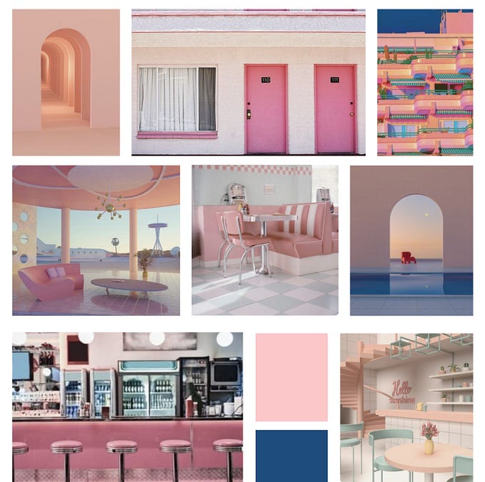
I started laying out some moodboards that could guide a pop-up in the direction of a unique stay or niche aesthetic of a location.

The placement of an Airbnb home itself, such as an A-frame cabin, would generate a lot of interest from people passing by. With a unique stay or a pop-up that appealed to people’s desire to travel and live in nice places, there could also be activities for people to engage with in the home itself.

Creating these moodboards helped me get a better idea of how I can leverage a certain visual style or aesthetic of a location in the pop-up. While a major selling point of Airbnb’s services is the ability to experience a variety of places, for the purpose of the pop-up, I felt it would be more effective to target a specific visual language or stay.
Company-Based
For ideas that deepened user’s understanding of the history of the Airbnb company itself, there was much more flexibility for the function of the space. I thought about ways I could bridge Airbnb’s original ideas to fun space that would allow for conversation and interaction.
One really fun idea I had was an “Air Bed & Breakfast Diner,” which speaks to Airbnb’s origins of serving breakfast for temporary stays.

Having a company-based idea would also allow for me to explore ways to bring in Airbnb’s own visual branding into a location, which differs from the rest of Airbnb locations that have their own style.
Shifting Concept Direction
After a feedback session with my peers, I felt like it was hard to push my current ideas further while still being able to emphasize Airbnb’s values. While a lot of my class gave helpful feedback on ways I can incorporate interactions into my diner idea, I wondered if there were more effective ways to demonstrate why a user would be encouraged to use Airbnb for their next trip.
I also knew that I even though the location-based ideas would be interesting, I wanted to find an idea with a more creative foundation so that I could build it out more throughout the project.
Going back to my research, I looked over the key insights and thought about two core, fundamental values that are unique to Airbnb:
- The versatility in experiences and stays for each trip. No Airbnb stay is the exact same as the other, and each Airbnb user can select their preference in a stay based on the unique interior of each room.
- A design-based, creatively driven service. Unlike other hotel services and vacation-rental sites, Airbnb has an affinity for creativity that connects with humans on a deeper, more exciting level.

As I started researching a bit more to see some real-life examples of some of these concepts, I came across a pop-up that was created from a collaboration between Virgil Abloh and Nike in London.

While the product and concept were entirely different, the background walls of the pop-up caught my attention. I really liked the “workshop” feeling of sketches and loose images formatted in a pin-up way. It made me feel like I was in the middle of seeing these shoes come to life, and there was something special about being present for what seemed like a crucial moment in Nike’s shoe designs.
This connected back to one of my ideas of an “Airbnb workshop” style that allows people to customize their own homes. But because I was having trouble with imagining how the user could customize this home without just viewing it through wall projections, I then shifted my idea into focusing on the customization experience itself.
I looked into other pop-ups that are centered around customizing a product or experience, and I found this cool video on creating custom Nike shoes:
It made me think about how this plays into the trend of people drawing or painting on their own Nike AF1s, and the customization aspect reminded me of the trends on social media of creating Pinterest moodboards and games around designing your own home.

Airbnb Design Studio
My idea behind an Airbnb Design Studio is to give users a sense of agency in designing a space while tapping into their own feelings of wanderlust. This would also allow highlight Airbnb’s flexibility and wide breadth of locations and homes and demonstrate that Airbnb can make your dream home come true.
This also allows users to step into the role of hosts, potentially even encouraging them to become one or at least understand the Airbnb slogan of “Made Possible by Hosts.”
There was a lot to build out from here, but I started thinking about the “design studio” aesthetic and looked back at the physical space of the Airbnb office itself.

Although this idea would need a lot of refinements, I thought about a few ways that the user could engage in a few different interactions:
- a digital moodboard wall where people can arrange aesthetics for their dream vacation
- modeling station where they can print or make their home?
- can go home with a guide/listing for their home to share on the Airbnb app
- Airbnb can scan for similar locations and curate a wishlist for the user’s account
To get a basic understanding of what this could look like, I started sketching out some interactions or “stations” that could be involved in the workshop.


I also thought about how this might be a fun group activity — perhaps users could come in with a group and they can collaboratively design a “dream home” that would spark conversation and allow for more creative exploration.
Feedback
After talking to a few others, the ideas definitely started connecting closer to the main values and appeal of Airbnb. However, it was important to factor in a range of considerations when working through the rest of the details:
- Arranging it as a group activity could allow for more conversation and excitement; this might mean tailoring the pop-up for younger audiences in Schenley Plaza could be nice so they can plan for a group trip together
- It would be helpful to have interactions with the app itself so users can download it and engage with the UI
- How can this experience be implemented in a physical space? How can this be different from taking an online survey?
- Would this experience be focused on allowing people to “step into the shoes” of guests? That way there could be features that allow people to consider messages for the guest, amenities, etc.
Working Through the Experience
Afterwards, I started building out the experience and interactions within the space. I wanted to think of ways to enhance the physical experience to create a distinction between the pop-up and an online survey.
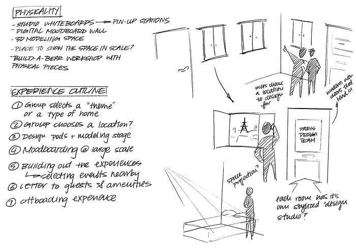
Within the space, I thought about ways to allow for group collaboration while allowing people to view what other projects are happening in the studio. Users can engage with screens to have a low barrier of use.

In addition to thinking about the space inside, I started brainstorming some general ideas for the exterior of the space. While nothing was set in stone, it was helpful to start thinking about ways to engage people in line and make use of different planes of the pop-up.

Considerations
- How should the overall shape of the studio look like? Curved walls?
- How long is the end-to-end experience of being the studio? How many people can it accommodate at once?
- Should the user flow be linear? Or follow a layout for more open-ended exploration?
Feedback from Peers
- When it comes to incorporating the physicality of the space, it’s important to get instant feedback or reward (people don’t want too much labor)
- Maybe for moodboarding, there can be ways to interact beyond screen restrictions (stretching, printing, tactile interactions)
- The hologram idea is good because people can get instant feedback on their space—maybe there is a way to include physical interactions here
- The physical space can either be open and a general area, or it can be a single room with interactions inside
- For the exterior of the space, maybe it could change between different homes or stays or at least show some sense of versatility
- Is it something people sign up for? Is it something that people pull up to?
- Maybe instead of building out the blocks explicitly, they can work with some pre-made models that people have made to get a good understanding of what is possible
Receiving feedback was great because it helped me also get to talk through some new ideas and figure out what interactions might be enjoyable or burdensome. The open-ended nature of the project meant the pop-up could go in a variety of directions, so it was important to make sure people would actually want to engage with them.
Tightening Up the Concept
For the next stage of the project, it was really important to start laying out the interactions and the actual overview of the space. Using some of the previous inspiration of other design studios and spaces, I created a moodboard that could act as a guiding factor for the overall space.
Adjectives to describe the space: open, collaborative, thoughtful. I wanted the space to have the neutral, open feeling of a regular design studio while still allowing for conversation, interaction, and movement.

My vision for the space includes a lot of open discussion and engagement, so I wanted to avoid spaces that felt too rigid and structured. I started designing some ideas for the floor plan so I could get a better understanding of how the parts of the “design workshop” can create an engaging flow through the space.
With this in mind, I started sketching out some general interactions that would be key aspects of the pop-up experience.

My conversation from previous feedback sessions made me think about potential ways to introduce physical models into the experience. This way, users can experiment with (and take pictures of) model homes to get a better understanding of what Airbnb is cable of and to gain some inspiration before building.

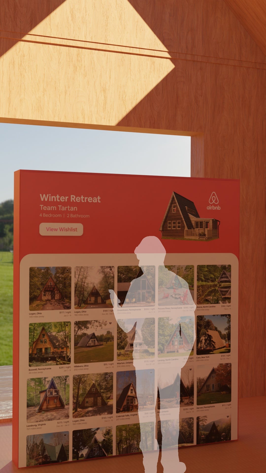
For the end part of the experience, users can engage with the Airbnb app itself to gain familiarity with the UI and browse homes that are similar to their “dream homes.” Groups can select homes they like and add it to a collaborative wishlist so they can begin planning their stay.


Overall, I knew the main part of the space would be focused on the designs. The “collaborative design” part of the space would be focused on allowing groups to spend time customizing their model and playing around with ideas for their dream home.
Because most design studios traditionally follow the four-walls format, I wanted to maintain that spatial consistency and didn’t want to stray too far from people’s idea of a studio.
Physical Prototyping
Based on the floor plan, I started prototyping some general forms for the space. Although I still wanted the space to feel like a traditional design studio, I wanted to explore different possibilities on how the exterior could look.
Based on my previous sketches and floor plan, I started out by creating a space with rounded corners to allow for an immersive feeling inside while still maintaining the form of a “studio.”


For the walls, I used a plastic film to show what the space could be like with “windows” so curious onlookers can see what models are being built and what activities are happening inside.


Following my second floor plan, I started working with curved walls to allow for a stronger emphasis on the “collaboration” part of the space. This format was particularly interesting in that it segmented the experience into different parts (design inspiration, modeling, moodboarding, etc.).
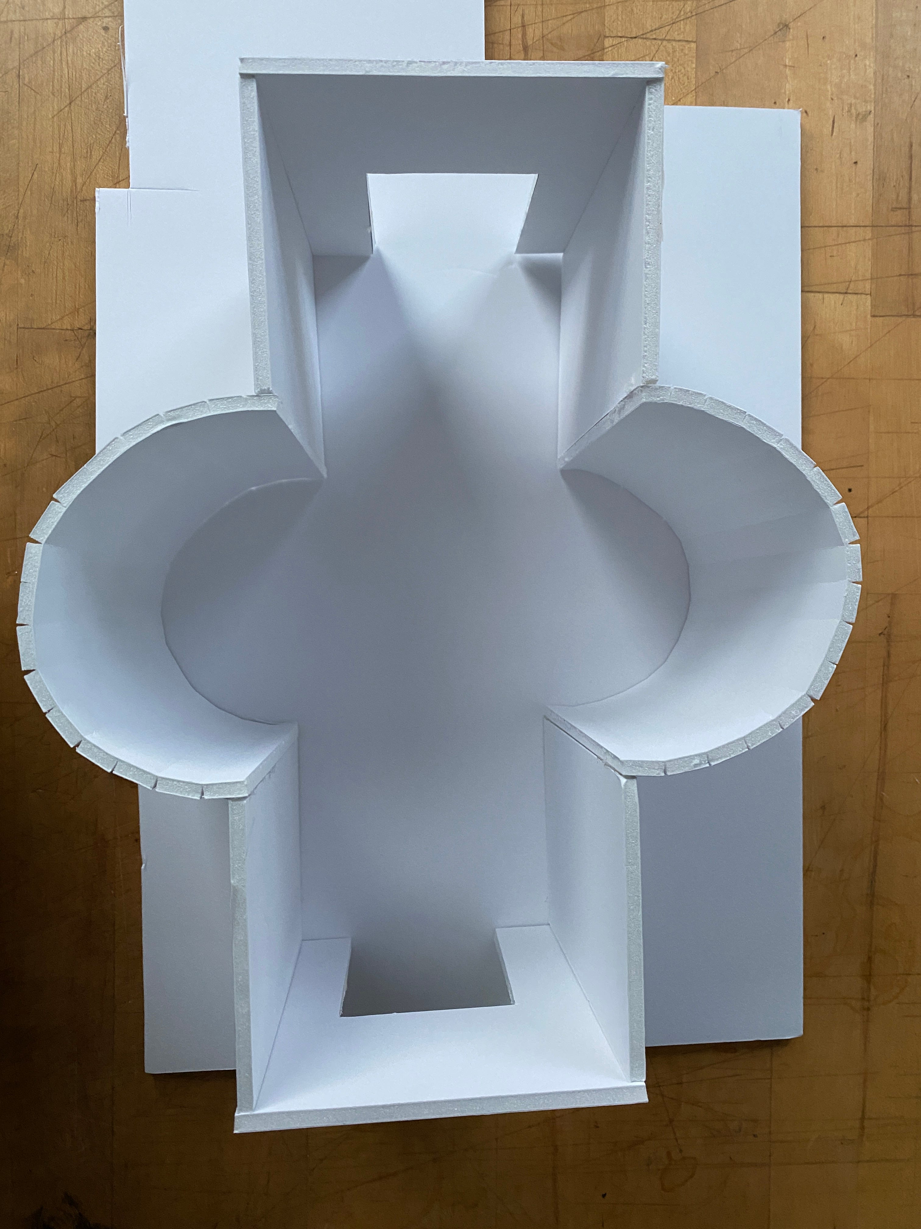

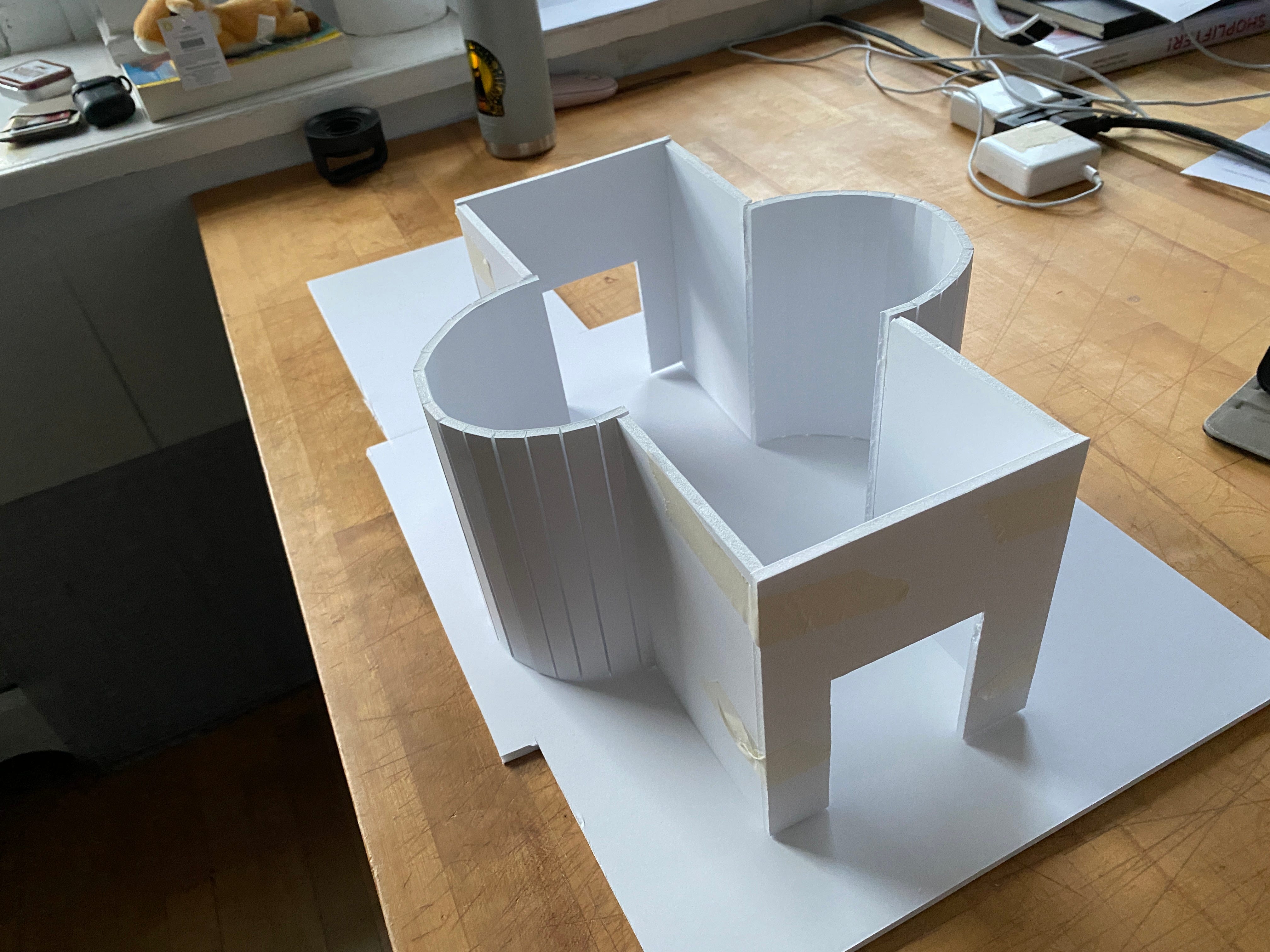


However, the idea of using curved walls started make me think about other alternatives that could be worth exploring. While I was still pretty set on choosing a space that aligned closely to the previous floor plans, I started prototyping a few sample spaces to expand on the potential of other curved layouts.


While it was definitely interesting to think about what other formats the studio could be presented in, I wasn’t sure if the nature of these exploratory spaces was effective for my concept.
Feedback
- A really important thing to consider is how to make the experience fun. Designing a home can be challenging, so it’s important to think about how to make it feel like game like Sims or Minecraft
- the circle tables might be awkward because you can only talk to the person next to you. Try to think about how this fits into the space
- For the form of the pop-up, maybe there can be murals on the outside that play into Airbnb’s visual brand or background in being design-heavy
- Having two circle tables might be too awkward because it’s only two groups at once, so maybe three that are offset?
Developing the Exterior
I still felt a little stuck on building out the exterior space of the design studio. I wanted to make it feel like a traditional design studio while also relating to Airbnb.
I realized it would be helpful to see what the actual design studios at Airbnb looked like. I found that on top of the main office itself, there were many locations for design studios/offices for Airbnb that followed a similar style.

Throughout the different Airbnb offices, there was a pattern of wood, layering, and the use of frames and shapes to create a space that is collaborative and creative.
Based on some of the existing Airbnb offices, I started sketching out some new ideas for the design studio.
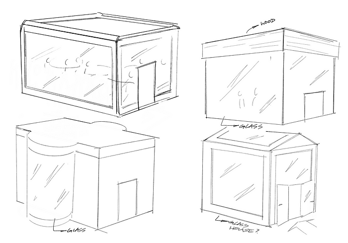
However, after these initial sketches, I still wanted to push the layout further so that it was more similar to rest of the offices. I started building more to see what other ways the exterior could appear.

Feedback
- The wooden box enclosure is a good idea, maybe it can be combined with the shape of the house
- The initial part of the experience can be pushed out to the exterior or in a different glass panel as it’s more of a leisurely activity than an engaging one
- The models should also show what the type of place is; this way, users can keep note of the place and maybe search it up on the app later
- Working through the collaborative interaction: it’s important to figure out what parts are group requirements and what parts are individual; moving forward, working through the interaction stages is really important to make sure it’s fun
- For the moodboard, instead of having a kiosk, it would be more engaging to have a full scale touch screen

After sketching out some new ideas for the exterior, I started to prototype physical models to see what they could look like in a physical context.


I started out with a base model to experiment with form and materiality and started to build out ideas for the glass extension.


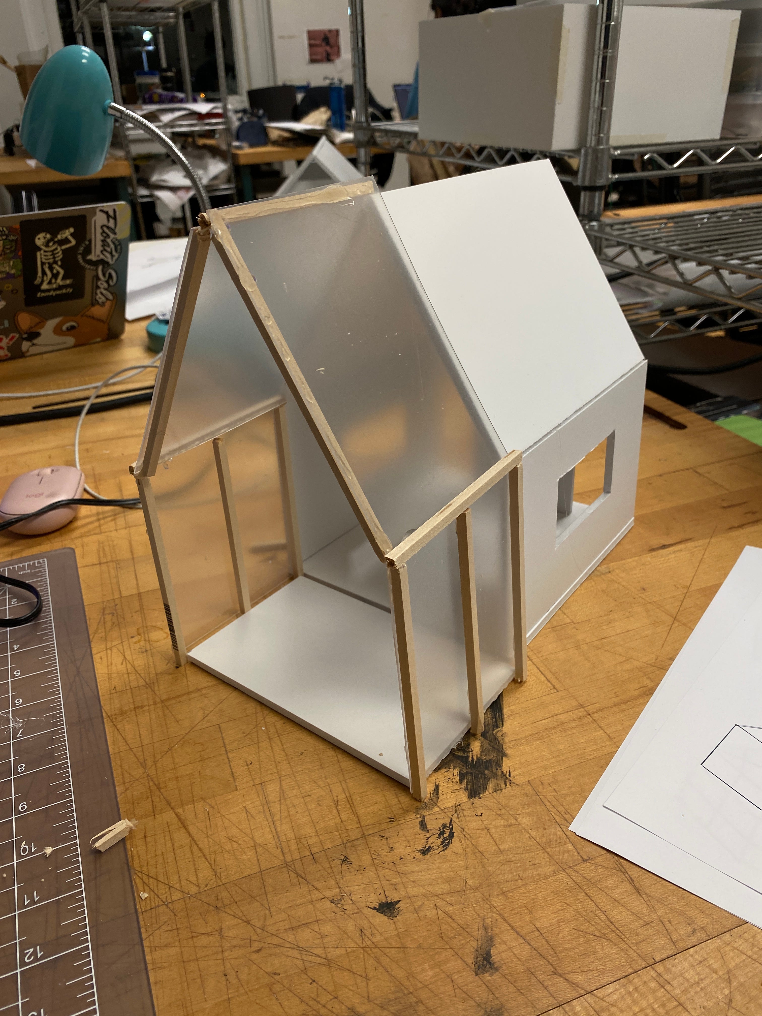
I liked this model because it reminded me a lot of a “blue print” house which spoke to the idea of a design space. I also wanted to try out the “patio” idea that would feel closer to a finished home.


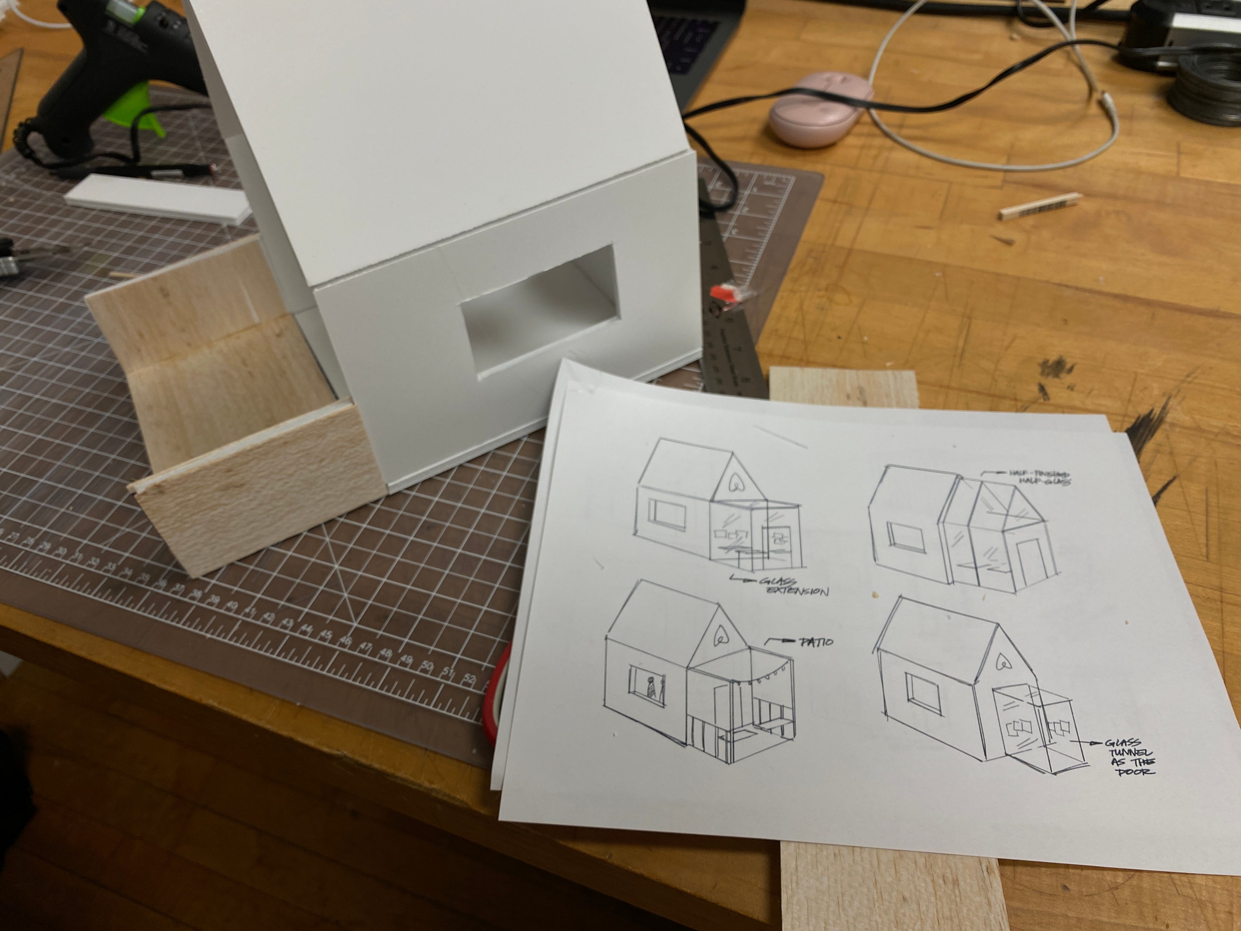

I resonated with the base model of the home, but in terms of refining the outdoor section, I had a lot of options to explore. It was really helpful to build out the sketches to see how the space might feel in scale.
In addition to changing the exterior, I worked to tighten the inside experience by sketching out the overall flow of the “collaborative design” interface sequence to make sure the process flowed intuitively.


Feedback
- What will the waiting experience be like for users outside of the studio? Maybe there can be a porch where people stand around while they wait
- The scale of the floor plan and models aren’t representative of the space itself; the next priority should be focused on scale
- The moodboarding section can act as a divider so the spacing is less awkward for people walking through
Scaling the Model
Moving forwards, my biggest focus was on scale. Now that I had the bulk of my interactions laid out, I started to measure out the space to adjust everything to proper scale.
Using a grid system, I started to measure out each of the components of the floor plan and space to make sure everything was properly sized within the constraints of 400 square feet.


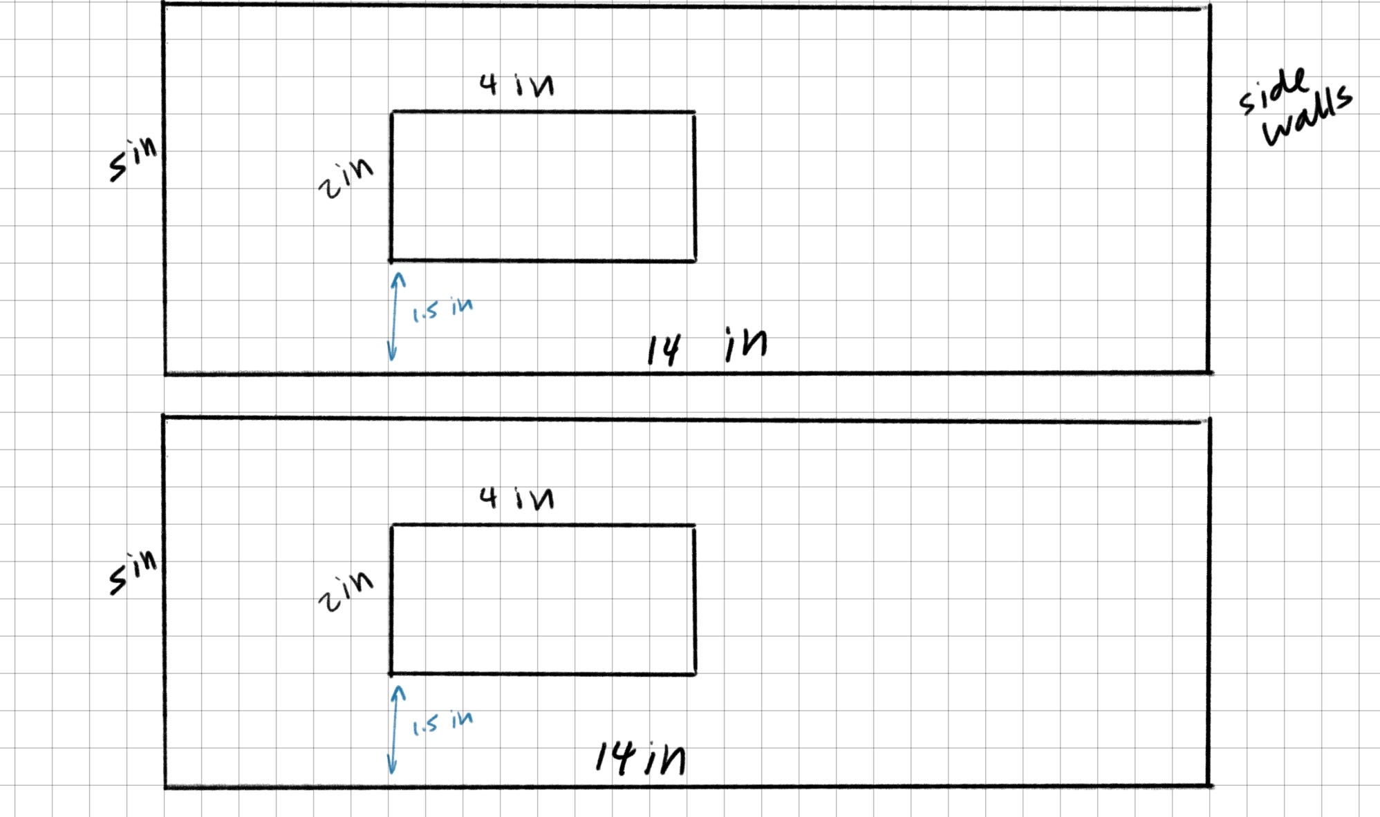


Based on these measurements, I started to assemble my final physical model using laser cut wood and acrylic. For the woodsticks, I measured out the lengths based on the model and cut the beams so they would have the “blueprint” feeling of a house.


Now that I had the measurements down for the design studio, I moved into digital modeling to begin creating the space for my visualizations.


However, after receiving feedback on the tables inside, I realized the interior felt too complicated and overwhelming at glance. I readjusted the seating inside so that the screens and the table would feel more connected.


I remodeled the tables and the chairs so they would be more ergonomic for the users. After I was done modeling the main components of the digital model, I moved the content into Blender to render out the rest of the materials.
UI Screens + Interactions
For the interior UI screens and interactions, I created a set of screens at scale to help visualize the content inside the design studio itself.
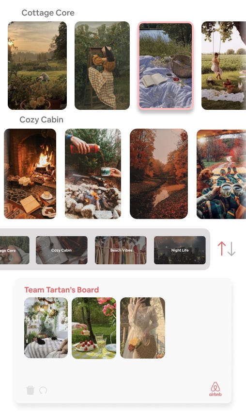

For the moodboards, because they were vertically oriented, it was important to allow users to switch between editing the board itself and browsing different aesthetics for their vacation.

When visitors exit the design studio, they can add homes that are similar to their model to their wishlist on their account and can take any photos with the Airbnb wall to refer back to when booking their vacation later on.
I chose the wishlist/matching option instead of instant booking because most users of Airbnb tend to plan out their vacations and schedules before making a decision, so this way, users can still take their time in choosing when to have their vacation.

Based on the wireframes that I sketched out earlier in the project, I created a set of UI screens that would show the design process visitors would go through. The initial screen would prompt users to log into their Airbnb account or create a new account so their progress is connected to their account.
Then the group participates in a set of game-like activities that customizes the base model home of their choice.
Final Model Progress + Visualizations
For the physical model, I assembled the laser cut wood and UI screens to first build out the interior space.


After creating the main interior, I started to build out the walls of the house shape for the design studio. For the initial design inspiration part of the experience, I used acrylic and wooden beams to show the glass section at the front.


Final Photos of Physical Model


Final Digital Visualizations in Schenley Plaza
For the digital model, I started working towards building the atmosphere that I wanted for the studio. It was really important to have the right lighting for the model so that it would fully encompass the warm, collaborative environment I was aiming for.


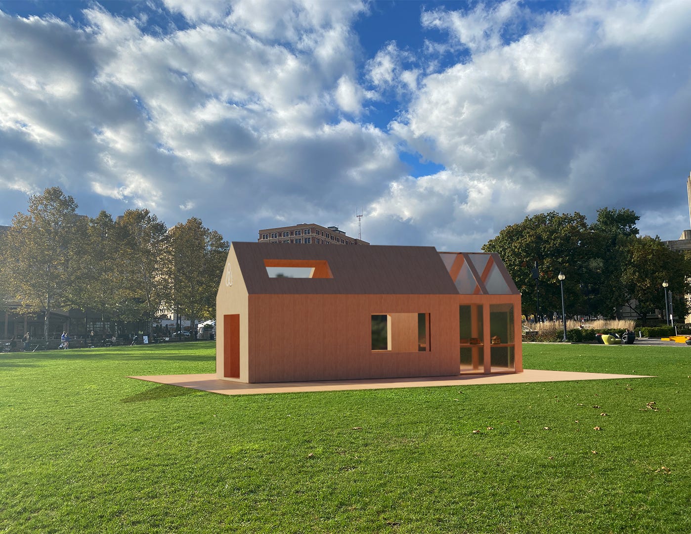

The placement of the space in Schenley would allow for groups to come by on warmer days. The wood coverage would ideally spark curiosity in people passing by without revealing too much activity inside.


Finally, I added visualizations to demonstrate what interactions would happen within the studio for each part of the experience.


Final Client Presentation
In reflection, this project was uniquely challenging in that I had to think as creatively as possible while still following Airbnb’s values and branding. The ability to experiment with an expanded scope of the what the space could look like (compared to previous projects) was extremely exciting, but it also presented many obstacles in making design decisions. I found it most effective to make progress by tying each decision back the research and core identity of Airbnb as a company. But instead of feeling restricted to the company, this thinking process actually helped me come up with more creative ideas and in-depth design opportunities.
For the overall concept, I knew I wanted a single, cohesive concept that would lead right back to Airbnb. I was most drawn to the idea of a design studio because it gave me a guideline and direction for the space and interactions without feeling to “messy” or inconsistent. My largest goal in creating a client-specific pop-up shop was to make a clear, enticing concept, so I made sure to avoid any paths that would be “bringing too much” into the equation. Despite the wide range of implementation options for this project, the most important aspect to prioritize was a clear and enjoyable user experience. By putting this at the forefront of my work, I knew the visuals and interactions would ultimately lead back to increased brand recognition and support.

